Address newsletter
Get the latest news on buying, selling, renting, home design, and more.
The COVID pandemic ushered in a lot of changes in how we live, including the paint color choices we make in our homes.
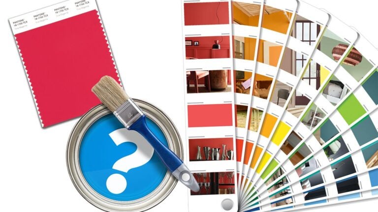
Sherwin-Williams released its colors of 2024, its Colormix forecast, on Aug. 9, and the pandemic played a major role in the selections.
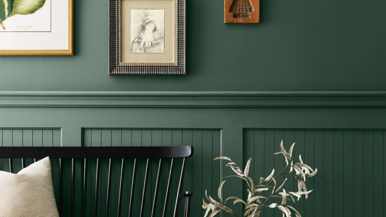
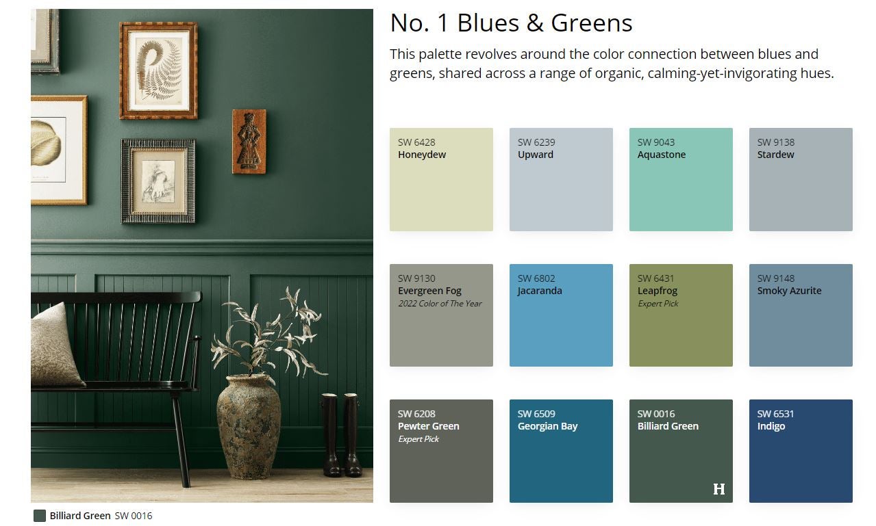
Blues and greens have grown significantly in popularity in the aftermath of COVID, according to the paint company.
“Coming out of COVID, all we talked about was nature. Nature-inspired colors, earth tones, that was super important. That’s where the forecast shift happened. For instance, greens have been really important from 2020-2025,” Wadden said.
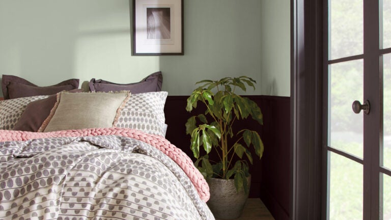
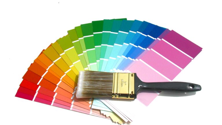
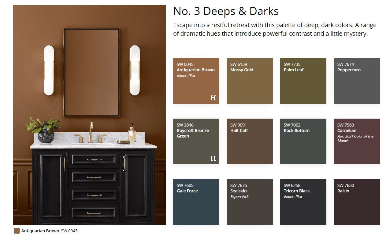
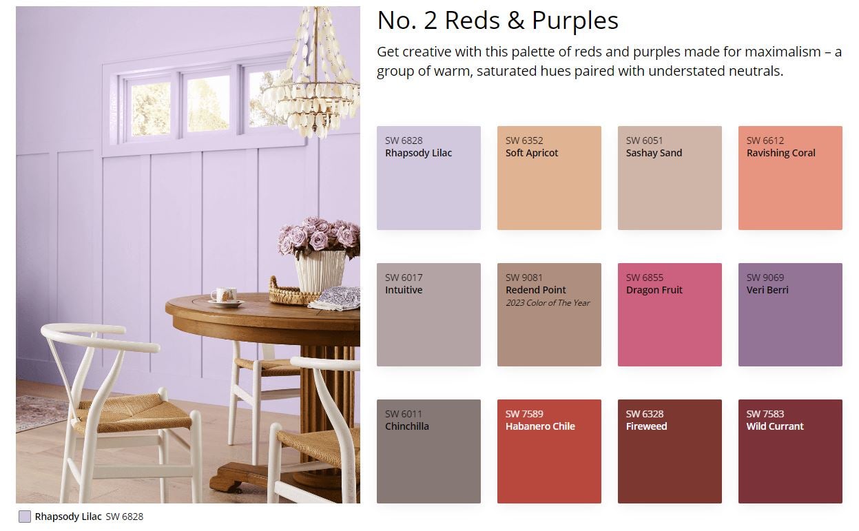
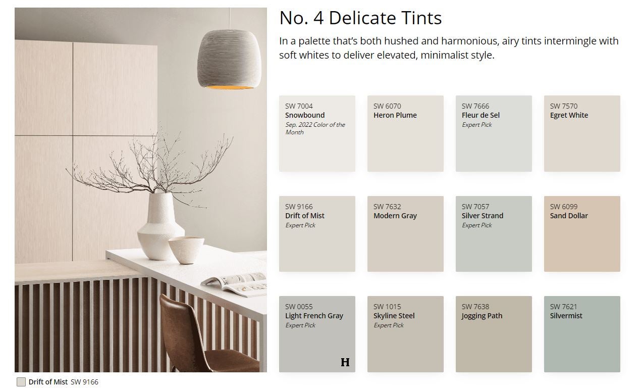
Organized into color families, the 48 hues in the Colormix all serve different purposes within the home. The four categories are blues and greens, reds and purples, “deeps and darks,” and “delicate tints.”
The forecast “really was developed for architects and designers to see what’s coming next, but homeowners love it because homeowners want to know what’s the hottest next thing,” Sue Wadden, director of color marketing for Sherwin-Williams, said.
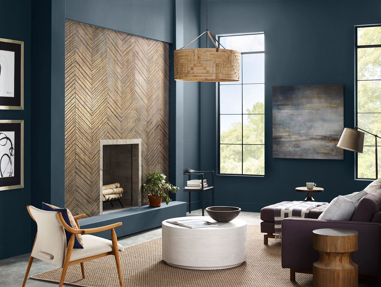
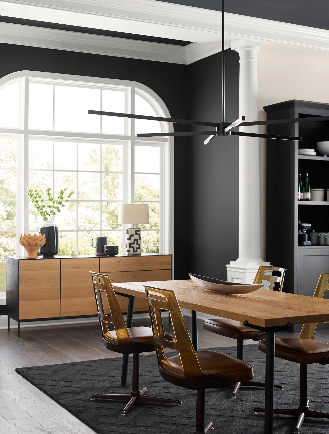
The “deeps and darks” section of the forecast is representative of the state of the world, Wadden said, noting that there has been a higher demand for sanctuary spaces in a home due to the level of uncertainty in many people’s lives.
“When we get to cycles of uncertainty, colors tend to get darker, more serious,” Wadden said.
Jarret Davis, a professor at the Massachusetts College of Art and Design, spoke to Boston.com about the psychology of colors and how they can create a certain atmosphere in a home.
“Everybody has a relationship to color in some way, and the home is one place where color is predominant,” Davis said.
Opinions on color are swayed by an individual’s experience, culture, and personal feelings, but the feelings tied to these colors are often a universal experience, Davis said.
Research, for example, has found blue to be unappetizing, so it is common for homeowners to avoid using blue paint or objects in their kitchens.
“The kitchen is the one room where you tend to find a consensus on color,” Davis said.
On the other hand, red is known to trigger hunger. When people see a red wavelength, their pupils dilate and their pulse increases, which can stimulate appetite, Davis said.
The colors associated with living spaces tend to vary significantly, depending on the atmosphere the homeowner is looking to create. Davis emphasized the importance of color temperature to create a certain feeling in a room, rather than a specific color.
“When we talk about color in a home, it divides into two separate categories. Warm and cool tones are the most ideal split in a home,” Davis said.
When people see a red wavelength, their pupils dilate and their pulse increases, which can stimulate appetite.
JARRET DAVIS, professor at MassArt
If a room wants to feel more spacious, Davis suggested using cool tones such as blues and purples, which also have been known to make homeowners feel more relaxed in the space. If someone is looking to create a feeling of coziness and comfort, warm-toned colors such as reds and browns will be more desirable, Davis said.
Wadden also noted the rise in popularity of dark-and-light contrasts in paint color in the post-pandemic world.
“Black in the home, especially on the exterior, has exploded, coming out of the sanctuary spaces of COVID,” Wadden said.
When choosing a combination of colors, homeowners often consider the psychology behind it all.
“When people are decorating their homes, they choose analogous colors, which are next to each other on the color wheel,” Davis said.
These pairings create a feeling of harmony and cohesiveness in a living space, Davis said.
Sherwin-Williams has adopted a biennial approach to its annual color report. The Aug. 8 release is known as the Colormix Forecast 2024, Anthology: Volume One.
“Through the launch of Anthology, we are thrilled to diversify our yearly color forecasting report to show the depth behind each color trend for the coming year,” Wadden said. “In releasing a new volume of the Anthology collection every other year, we hope to bring new color insight to the distinct chromatic families that our designers, industry pros, and savvy DIYers have come to know and love. These palettes — organized by color family for ease of use — will represent the beautiful shifts we are seeing within the world of color here at Sherwin-Williams.”
Get the latest news on buying, selling, renting, home design, and more.


Conversation
This discussion has ended. Please join elsewhere on Boston.com