Address newsletter
Get the latest news on buying, selling, renting, home design, and more.
In 1999, Pantone, the company that standardized the way the design industry specifies color, unleashed its first Color of the Year. According to its website, Pantone aims to “engage the design community and color enthusiasts around the world in a conversation around color.” Paint companies have since joined the fray, also naming annual “it” colors, enlivening the discussion.
In choosing a year’s reigning hue, the experts often draw correlations between color and culture. They may reference recent events, decreeing color as a salve. For instance, Pantone described its 2009 pick, “Mimosa,” as expressing “hope and reassurance in a time of economic uncertainty and political change.” The company described its 2023 color, “Viva Magenta,” as promoting “experimentation and self-expression.”
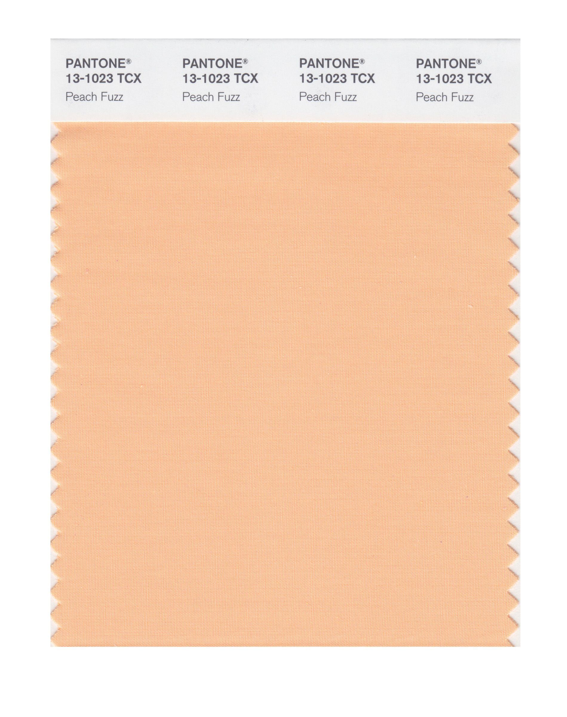
As we awaited Pantone’s pick for 2024 to be unveiled on Dec. 7 — it’s “Peach Fuzz” — we examined the other Color of the Year picks. How is the color cabal interpreting our experiences, anticipating our needs, and steering our emotions for the coming year? Let’s find out.
Perhaps responding to the bold self-expression of 2023, many companies graced us with shades meant to soothe, balance, restore, energize, and uplift. Dunn-Edwards’s “Skipping Stones,” according to a press release, is a “serene and steely blue with hints of green and gray that emulates the meditative, yet energizing feeling of the sea.” Furthermore, it “captures a collective yearning to slow down and achieve balance and tranquility.” Wow, count us in.
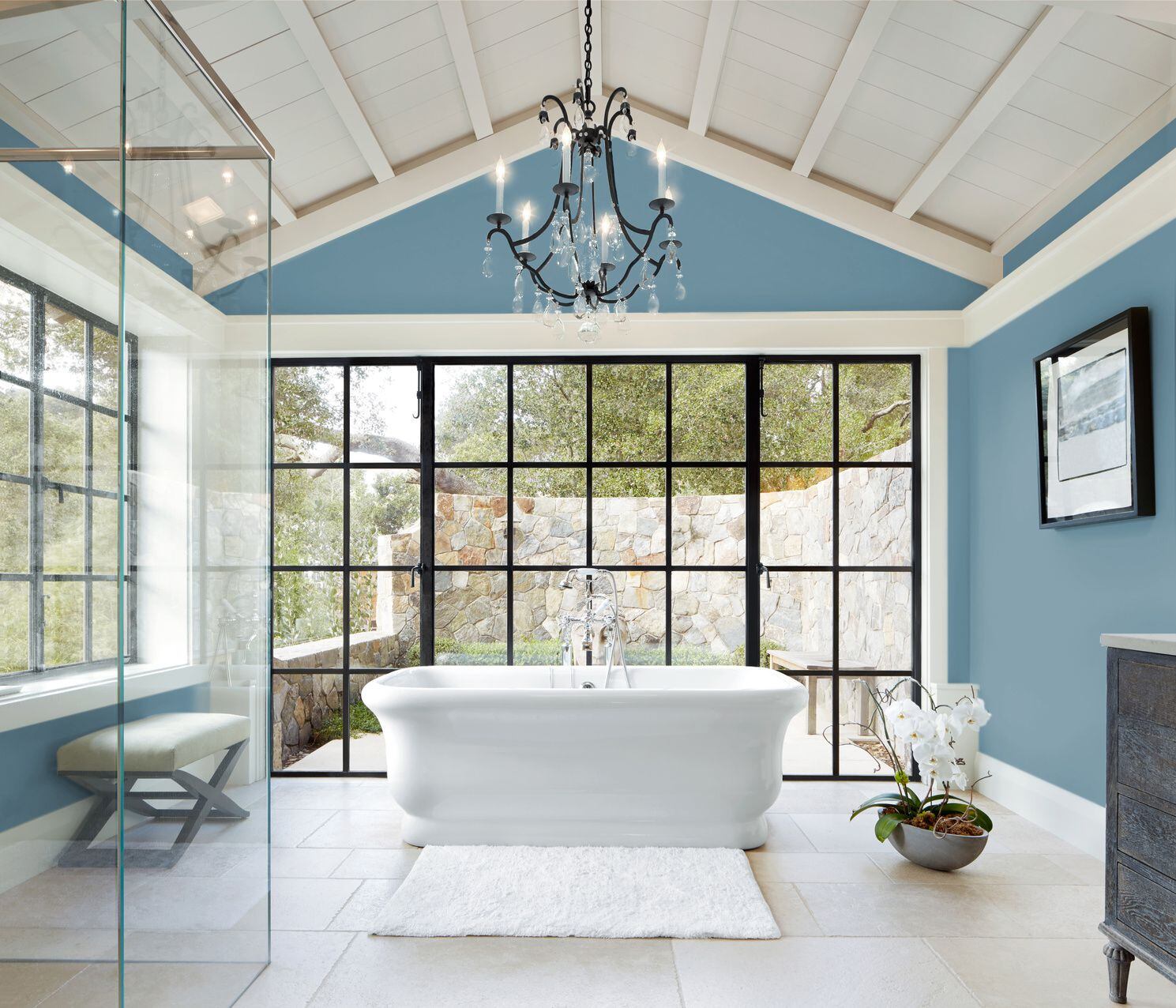
Sherwin-Williams’s “Upward,” a “breezy and blissful” blue, “invokes the ever-present sense of peace found when slowing down, taking a breath, and allowing the mind to clear,” its press releases reported. Similarly, Sherwin-Williams’s Valspar brand named “Renew Blue,” a “balanced blue with a touch of grayed sea-green” that establishes a “restful and meditative mood.”
How do local interior designers feel about these iterations of New England’s favorite color? Sherwin-Williams’s “Upward” was a dud; the dull blue-gray failed to pull in much response. Several designers noted, however, that Dunn-Edwards’s and Valspar’s blue-greens are fitting for this history-rich coastal region.
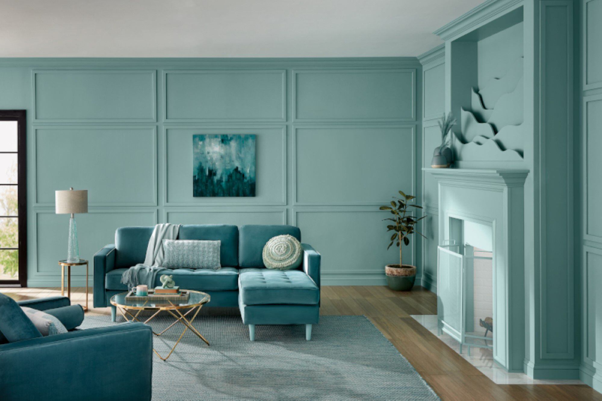
Stain manufacturer Minwax delves deeper into the sea with “Bay Blue,” a saturated teal about which local tastemakers show enthusiasm. “It’s similar to my favorite Farrow & Ball paint color, ‘Inchyra Blue,’” Kristine Irving of Koo de Kir Architectural Interiors in Boston said. “We recently painted the walls, millwork, and ceiling of a home library in Cambridge in it.” She also used it on a ceiling in a South End town house and as accent pillows in Marblehead. “I’d use this color for anything,” she said.
Most of our designers gave a thumbs-down to Krylon’s “Bluebird.” The spray paint company’s Color of the Year materials describe the intense shade as “uplifting,” but others dub it jolting. “It reminds me of a bad beach house,” Cecilia Casagrande of Casagrande Studio in Brookline said.
Thiara Borges Dananberg of Studio Borges in Framingham begged to differ. “As a South American New Englander, I’m thrilled to see bright colors,” she said. “That cornflower blue would be fantastic in a den; bonus points if you lacquer it.”
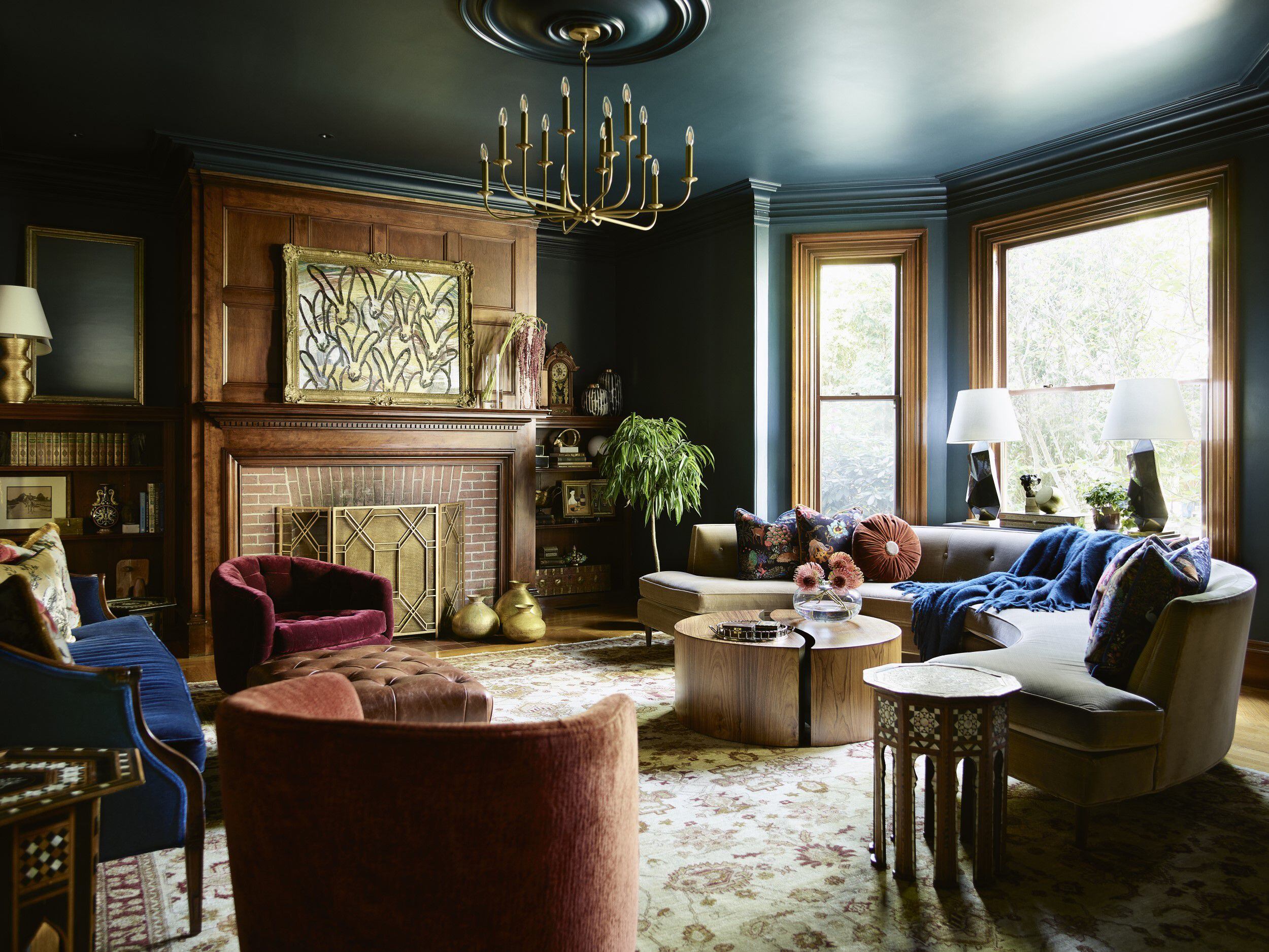
The New England designers we surveyed are tending toward rich burgundies and browns, best captured here by Rust-Oleum’s “Chocolate Cherry.” The brand’s Color of the Year verbiage includes “coziness,” “reassurance,” and “authenticity.” Tyler Karu of Tyler Karu Design and Interiors is inspired by the color’s versatility in that it pairs easily with other hues and can lean traditional or sleek. “Chocolate works with almost every style of architecture and furniture,” Karu said.
Looking at the collection as a whole, Karen Swanson of New England Design Works in Manchester-by-the-Sea observed that these all feel like colors we’ve seen before but that designers are combining them in ways that feel fresh.
As for the merit of the whole Color of the Year rigmarole, Jennifer Clapp, interiors principal at Hacin in Boston, said their team uses the collection as a roadmap for avoidance. “By the time colors reach the design industry, they have already cycled through fashion, which is geared towards the younger generation,” Clapp said. “Do I want my clients’ living room sofa to look like a 20-something’s smoky raspberry sweat shirt?” No, she does not.
Laura Keeler Pierce of Keeler & Company, a proponent of color in design, harkens back to Pantone’s raison d’etre. “Color of the Year at the very least gets us talking about something besides white, black, and gray,” Pierce said.
Dana Arazi Levine, Arazi Levine Design, arazilevine.com
I love using dark, moody colors because they bring a touch of sophistication and depth. Maroon (like Rust-Oleum’s “Chocolate Cherry”) holds a special place among my favorites; despite its rich, moody tones, it manages to convey warmth and invitation. I find it particularly well-suited for spaces where you aim to exhibit design boldness or make a lasting impression on guests — like powder rooms, bars, or butler’s pantries.
Jeanne Barber, Camden Grace Interiors, Camden-grace.com
I’m surprised but excited to see the cooler, vibrant blues make a resurgence, like Benjamin Moore’s “Blue Nova.” These colors were big in the ′80s and ′90s (I had a periwinkle bedroom), but in the last decade, blues with warmer undertones have been prolific (think of all those jewel-toned teal libraries). There’s a place for both at the table. In fact, mixing cool blues and warm blues gives a room some pop and avoids it reading flat.
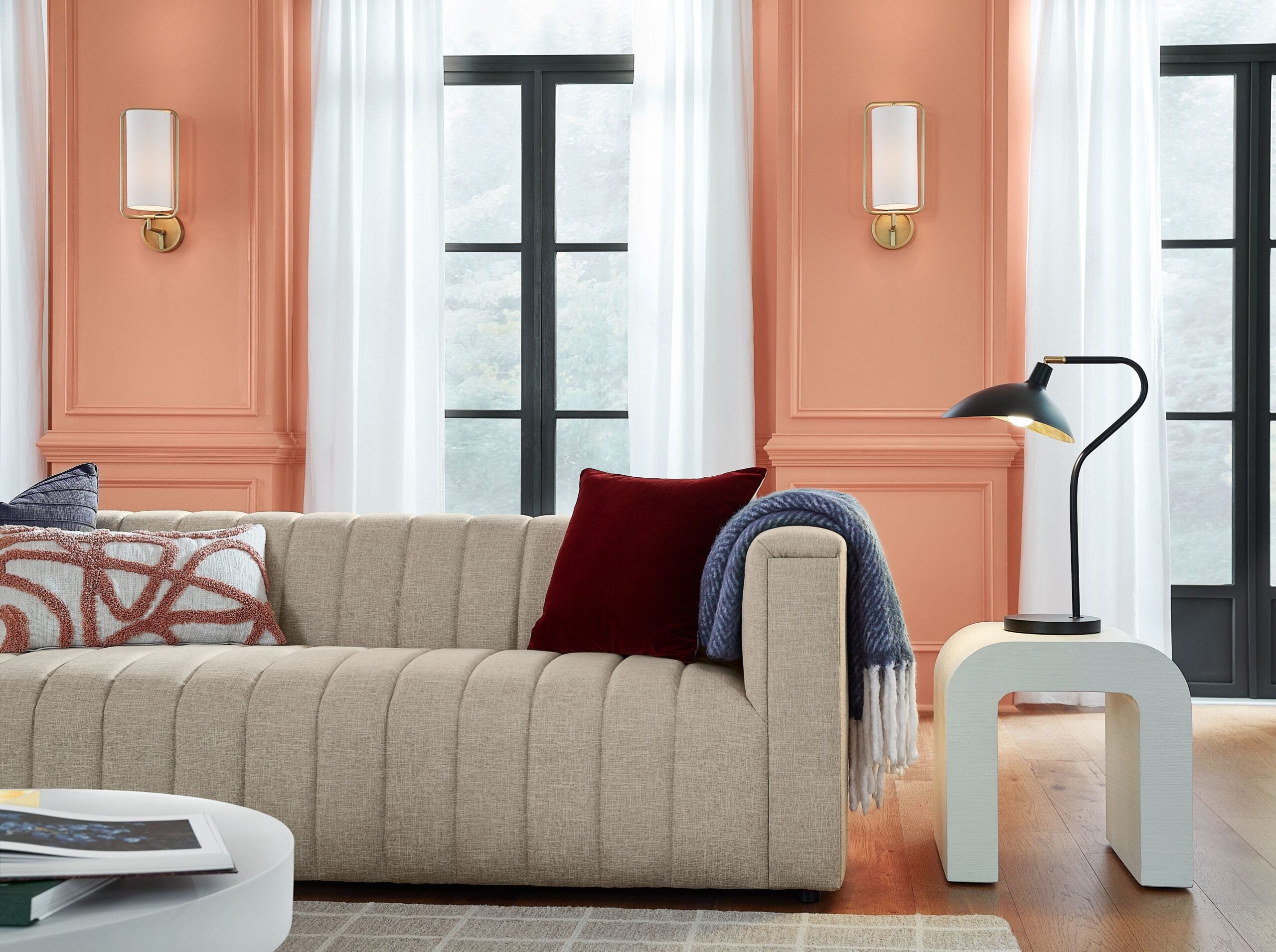
I will always love a blush (like Dulux’s “Sweet Embrace”), but not in the traditional context of a little girl’s room. It’s one of those colors that goes with everything: green, mustards, RED! Love a blush and red combo. If you’re scared of a vibrant red, a rich burgundy color also pairs nicely.
Cecilia Casagrande, Casagrande Studio, casagrandestudio.com
Benjamin Moore’s “Blue Nova” surprises me in a world of browns, creams, greens, and navy. Those colors are the trends I have been seeing for a while now, but the “Blue Nova” makes me feel hopeful that people still love a nice, classic denim blue.
Erica Vanderhoof Palm, Newton Kitchens & Design, newtonkd.com
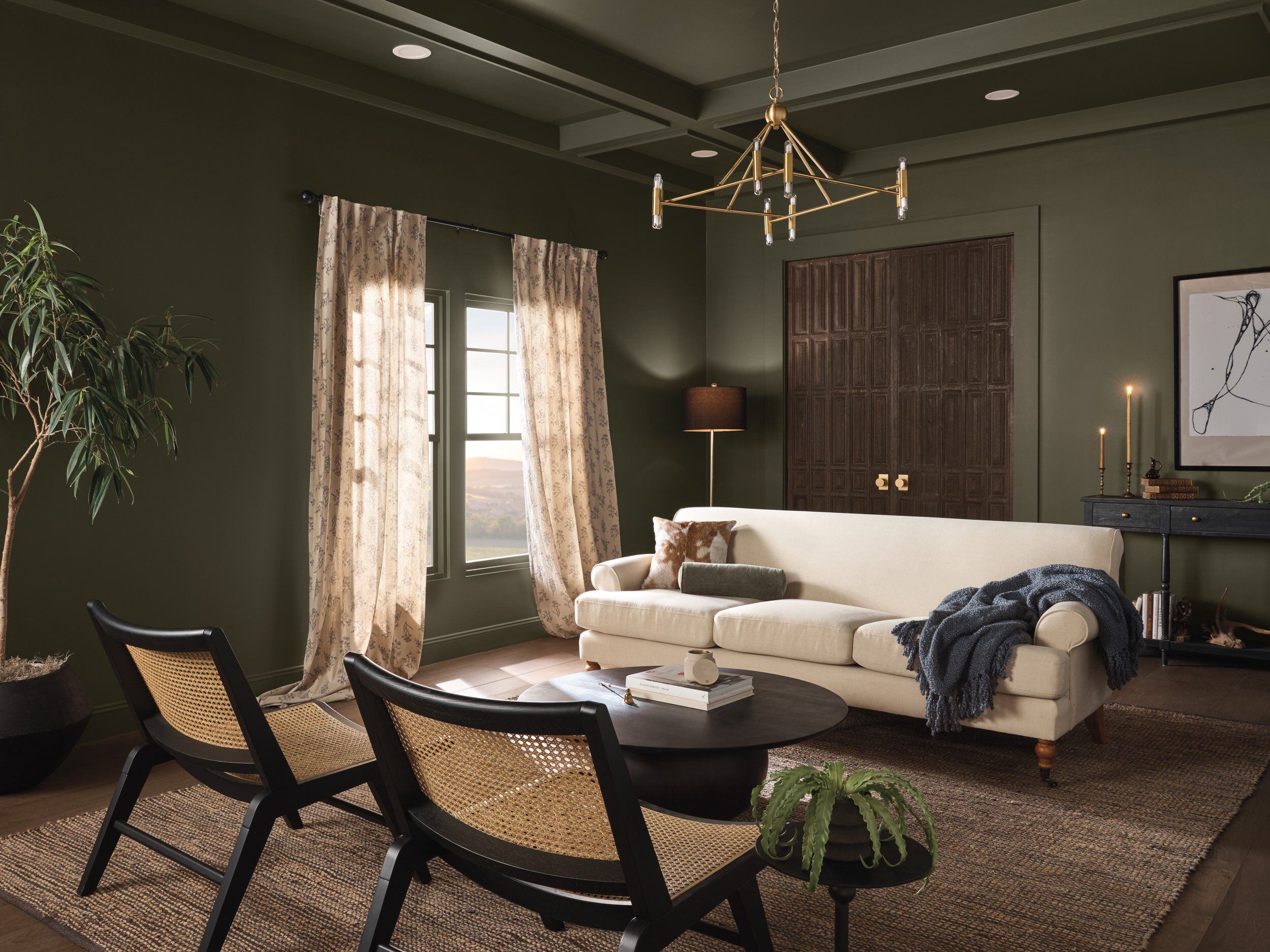
I’m leaning toward earthy sage green and olive tones (like Graham & Brown’s “Viridis”) as an accent in traditional and transitional kitchen designs as an alternative to blue. Green tones are a beautiful complement to light white oak wood flooring, as well as a lot of the natural marbles and quartzite countertop materials.
Karen Swanson, New England Design Works, ne-dw.com
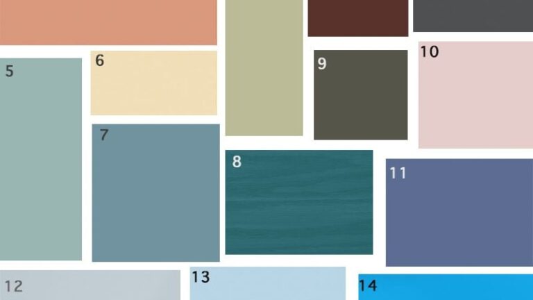
I am working on a project with a wallpaper that combines colors similar to many of these: HGTV Home by Sherwin-Williams’s “Persimmon,” Rust-Oleum’s “Chocolate Cherry,” Behr’s “Cracked Pepper,” Glidden’s “Limitless,” Dutch Boy’s “Ironside,” and Dulux’s “Sweet Embrace.”
It is a striking combination of colors I have not seen very often. We will use the wallpaper on a very high ceiling to bring down the scale and add warmth to the space.
Laura Keeler Pierce, Keeler & Co. Interior Design, keelerandco.com
I’m surprised there aren’t more warm tones here; I’ve noticed such a shift toward browns, beiges, mulberry, and sage. I love the mouse-y shade of gray/brown (Dutch Boy’s “Ironside”). It would be perfect in a library where you could retreat at the end of the day.
While orange is not my go-to, the soft pumpkin tone (HGTV Home by Sherwin-Williams’s “Persimmon”) is changing my perspective. I can see casing and trim painted this color in a quirky, playful attic room of an old summer cottage. It’s youthful and energizing.
Katie Boucher, Right Angle Kitchens and Design Inc., rightanglekitchens.com
Many of our clients connect with warm greens (like Graham & Brown’s “Viridis” and Dutch Boy’s “Ironside”) because it complements many wood tones in their existing decor and architecture and reads as an organic addition to the room’s palette. Warm greens are wildly versatile. Whether it’s a moody or muted tone, it’s almost always a calming hue. Green can make you feel grounded.
Kristine Irving, Koo de Kir Architectural Interiors, koodekir.com
I think I’ve embraced color more as I’ve gotten older. Graham & Brown’s “Viridis,” Rust-Oleum’s “Chocolate Cherry,” and Dutch Boy’s “Ironside” were the colors of my Thanksgiving table this year. My mom was surprised because I usually use white linens.
Sarah Cole, Sarah Cole Interiors, sarahcoleinteriors.com
I love this collection of colors. It indicates a clear shift away from whites and grays. While there are some saturated hues, the inclusion of softer shades feels refreshing. The soft blues and greens work well in coastal homes. The more saturated and earthy red, olive, and charcoal are beautiful choices for the area’s older homes. We have used many of them in recent years in homes here in New England, sometimes in big ways, like on cabinetry and walls, and other times as accent colors.
Shannon Tate, Shannon Tate Interiors, shannontateinteriors.com
I’d love to see the darker colors (Behr’s “Cracked Pepper” and Dutch Boy’s “Ironside”) in a bedroom or family room. They both feel very cozy and would feel really nice wrapping around the room, ceilings included; also perfect for a chilly winter day with blankets and a warm cup of something delicious.
Marni Elyse Katz is a contributing editor to the Globe Magazine. Follow her on Instagram @StyleCarrot and Address @globehomes.
Get the latest news on buying, selling, renting, home design, and more.


Conversation
This discussion has ended. Please join elsewhere on Boston.com